CSS3 allows us to opting animations upon the HTML elements. Here the JavaScript /Flash is not opted for the animation. Animation means to gradually change one style of element to another style. There are many CSS properties can be changed in CSS3.A user can change the property many times as he crave for. User must specify some key frames for the animation. These Key frames hold the styles of the element of specific times.
The rule of @keyframes-
If a user mention styles of CSS inside the @keyframes rule then the animation will progressively change from the existing style to the new style in the interval of fix times. We should have to combine the animation with an element. The example below combines the animation "example" with the element <div>. The animation will last for 6 seconds, and it will progressively convert the background-color of the element <div> from "yellow" to "blue":
Example-
@keyframesexample{
from {background-color: yellow;}
to {background-color: blue;}
}
/* Following are the element whom animation is to be applied */
div{
width: 200px;
height: 200px;
background-color: yellow;
animation-name: example;
animation-duration: 6s;
}
In above example style will be changed using the keywords "from" and "to".
Delay an Animation-
In the below example animation-delay property indicates a delay for the start of an animation. It has a 4 seconds delayed before starting the animation.
Example-
div{
width: 200px;
height: 200px;
position: relative;
background-color: red;
animation-name: example;
animation-duration: 6s;
animation-delay: 4s;
}
The animation-iteration-count property-
The animation iteration count property fix the number of times an animation should be run. The example below will execute a program to play animation 4 times before it stops.
Example-
div{
width: 200px;
height: 200px;
position: relative;
background-color: green;
animation-name: example1;
animation-duration: 4s;
animation-iteration-count: 4;
}
However, the below example will execute a program to play animation "infinite” times continue forever.
Example-
div{
width: 200px;
height: 200px;
position: relative;
background-color: green;
animation-name: example2;
animation-duration: 4s;
animation-iteration-count: infinite;
}
To Run any Animation in Reverse Direction/Alternate Cycles-
It runs an animation either in reverse direction or alternate cycles. The example below will run animation into reverse direction.
Example-
div{
width: 200px;
height: 200px;
position: relative;
background-color: green;
animation-name: example3;
animation-duration: 4s;
animation-iteration-count: 4;
animation-direction: reverse;
}
The example below, where we are using "alternate" value, it runs the animation first forward, then backward, then forward and so on.
Example-
div{
width: 200px;
height: 200px;
position: relative;
background-color: green;
animation-name: example4;
animation-duration: 4s;
animation-iteration-count: 4;
animation-direction: alternate;
}
Shorthand Property of Animation-
In the following example there are six animation properties and we can display them by Shorthand Property.
Example-
div{
animation-name: example5;
animation-duration: 4s;
animation-timing-function: linear;
animation-delay: 3s;
animation-iteration-count: infinite;
animation-direction: alternate;
}
This, above animation effect is achieved by the following code using shorthand property of animation.
Example-
div{
animation: example4slinear3sinfinitealternate;
}
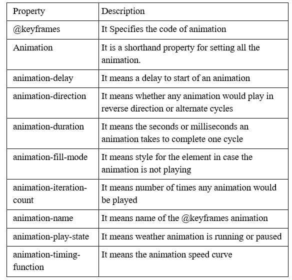
CSS3 Animation Properties-