CSS3 opted transforms to translate, rotate, scale, and skew the elements. A transformation is a procedure where an element changes shape, size and position. CSS3 helps in 2D and 3D transformations. Following are the method which is opted for 2D transformations-
• translate()
• rotate()
• scale()
• skewX()
• skewY()
• matrix()
Translate () Method-
The method translate () in CSS3 moves an element from its existing position to specified position. The element moves as per the parameters specified for the X-axis and the Y-axis. In the following example here the <div> element moves 25 pixels to the right and 50 pixels down from its existing position-
Example-
div{
-ms-transform: translate(25px, 50px); /* statement supported by IE 9 Browser */
-webkit-transform: translate(25px, 50px); /* statement supported by Safari Browser*/
transform: translate(25px,50px);
}
Rotate() Method-
The rotate() method rotates an element, according to a specified degree in clockwise or counter-clockwise. Here the following <div> element rotates clockwise with 30 degrees-
Example-
div{
-ms-transform: rotate(30deg); /* statement supported by IE 9 Browser */
-webkit-transform: rotate(30deg); /* statement supported by Safari Browser*/
transform: rotate(30deg);
}
When we will use negative values it rotate the element counter-clockwise. The <div> element in the following example will rotates counter-clockwise with 30 degrees-
Example-
div{
-ms-transform: rotate(-30deg); /* statement supported by IE 9 Browser */
-webkit-transform: rotate(-30deg); /* statement supported by Safari Browser*/
transform: rotate(-30deg);
}
Scale() Method-
The method scale() increases or decreases the size of an element. The size of element is changed as per the specified parameters of width and height. In the following example the element <div> increases three times of its original width, and two times of its original height:
Example-
div{
-ms-transform: scale(3, 2); /* statement supported by IE 9 Browser */
-webkit-transform: scale(3, 2); /* statement supported by Safari Browser*/
transform: scale(3,2);
}
The <div> element decreases to the half of its original width and height in the following example-
div{
-ms-transform: scale(0.5, 0.5); /* statement supported by IE 9 Browser */
-webkit-transform: scale(0.5, 0.5); /* statement supported by Safari Browser*/
transform: scale(0.5,0.5);
}
SkewX() Method-
The method skewX() skews an element beside the X-axis as per the specified angle. The example below skews the <div> element by 30 degrees beside the X-axis-
Example-
div{
-ms-transform: skewX(30deg); /* statement supported by IE 9 Browser */
-webkit-transform: skewX(30deg); /* statement supported by Safari Browser*/
transform: skewX(30deg);
}
SkewY() Method-
The method skewY() skews an element beside the Y-axis as per the specified angle. The example specified below skews the <div> element 30 degrees beside the Y-axis-
Example-
div{
-ms-transform: skewY(30deg); /* statement supported by IE 9 Browser */
-webkit-transform: skewY(30deg); /* statement supported by Safari Browser*/
transform: skewY(30deg);
}
Skew() Method-
The method skew() skews the element beside the X and Y-axis as per the specified angles. The example below skews the <div> element by 30 degrees in X-axis, and 20 degrees in Y-axis-
Example-
div{
-ms-transform: skew(30deg, 20deg); /* statement supported by IE 9 Browser */
-webkit-transform: skew(30deg, 20deg); /* statement supported by Safari Browser*/
transform: skew(30deg,20deg);
}
If we didn’t provide the second parameter than its value is zero by default. The example below skews the <div> element 20 degrees in the X-axis-
Example-
div{
-ms-transform: skew(20deg); /* statement supported by IE 9 Browser */
-webkit-transform: skew(20deg); /* statement supported by Safari Browser*/
transform: skew(20deg);
}
Matrix() Method-
The method matrix() concatenates all the 2D transform methods under one method. The method takes 6 parameters, which contains mathematical functions, and consent us to rotate, scale, move (translate), and skew elements. Following are the parameters of matrix function-
matrix(scaleX(),skewY(),skewX(),scaleY(),translateX(),translateY())
Example-
div{
-ms-transform: matrix(0, -0.2, 0, 1, 0, 1); /* statement supported by IE 9 Browser */
-webkit-transform: matrix(0, -0.2, 0, 1, 0, 1); /* statement supported by Safari Browser*/
transform: matrix(0,-0.2,0,1,0,1);
}
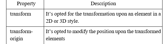
Transform Properties of CSS3-
In this table we listed diverse 2D properties of transform where transform and transform-origin are 2 different properties which is described-