In the upbringings of the CSS, CSS3 appears. It contains the new features of CSS and the previous also. The new style sheets called CSS3 have numerous advance features and properties like rounded corners, shadows, gradients, transitions or animations, also new layouts like multi-columns, flexible box or grid layouts. It’s completely backwards-compatible with previous CSS versions. The new CSS3 properties are implemented in modern browsers.
CSS3 Modules-
CSS3 has special "modules", which also have the old CSS specifications. They have been split into smaller pieces. Some new modules are added in it. Following are the some frequently used CSS3 modules. As-
• Selectors
• Box Model
• Backgrounds and Borders
• Image Values and Replaced Content
• Text Effects
• 2D/3D Transformations
• Animations
• Multiple Column Layout
• User Interface
Difference between CSS and CSS3-
• CSS3 is an enhanced version of CSS2. It maintains compatibility with all of the previous CSS's features. It doesn't censure any of the CSS code. The CSS3 code was opted to develop a Web page with the feature of better appearance and faster loading. It also reduces the development time to prepare web pages in a user's browser.
• CSS3 also makes Web design less contingent on image files for page blueprint elements. It reduces the file transfer requests and the download time by using less number of images.
• The CSS1 mainly focused on appearance formatting.
• The CSS2 further positioning capabilities for text and objects.
• CSS3's and its added features are not supported by the older browser e.g. IE 9 or prior version.
Include rounded corners & gradients using CSS3-
Earlier Web developers desired to design image files to add things like rounded corners for structural borders and background image gradients. But now CSS3 has same feature with a few lines of code. In CSS, a developer has to design/create a border or gradient, upload it into the image server, place the same image on the web page and use Cascading Style Sheet to correctly position the border. In CSS3, the developer can do same with the following code as-
Example-
".roundBorder {border-radius:10px;}".
More over the Background gradients are slight bit complicated and they involve different code for different browsers. E.g. a white-to-black gradient for Chrome and IE opted the code as: ".gradBG {background: liner-gradient (white, black);}".
Include animation and text effects using CSS3-
CSS3 has number of advance features to improve the web page like developers can include a text-shadow to the text also to compose it easy to read add visual stylishness. It can force the line breaks within the longer words to make them fit inside the columns with the feature of using word wrap.
Before CSS3, Web developers opted animation code in scripting languages like JavaScript, vb Script and jQuery. CSS3 provides many animation features and they can be implemented in the design layer. The W3C is continuously working for Web animation standards.W3C is also working on compatibility issues between the different types of animation techniques.
Example- (Animation)
<!DOCTYPE html>
<html>
<head>
<style>
div{
width: 100px;
height: 100px;
background-color: red;
-webkit-animation-name: example;
-webkit-animation-duration: 4s;
animation-name: example;
animation-duration: 4s;
}
/* Safari 4.0 - 8.0 */
@-webkit-keyframes example{
from {background-color: red;}
to{background-color: yellow;}
}
/* Standard syntax */
@keyframes example{
from {background-color: red;}
to{background-color: yellow;}
}
</style>
</head>
<body>
<p><b>Note:</b> This example does not work in Internet Explorer 9 and earlier versions.</p>
<div></div>
<p><b>Note:</b> When an animation is finished, it changes back to its original style.</p>
</body>
</html>
CSS3 Defines Text Columns-
CSS3 also has the potential to split text sections into multiple columns like a newspaper. However in the CSS2 it’s tricky to construct multi-column text sections and it does not involuntarily split text. This feature of CSS3 is beneficial especially with the sites whose feature is responsive design. A development technique rearranges and resizes content based on the viewing device's screen.
CSS3 border-radius Property-
Using CSS3, we can give "rounded corners" for any element, using the property border-radius. Following are three examples of this property-
Example-
#rcorners1{
border-radius: 30px;
background: #73AD21;
padding: 40px;
width: 400px;
height: 200px;
}
#rcorners2{
border-radius: 30px;
border: 4pxsolid#73AD21;
padding: 40px;
width: 400px;
height: 200px;
}
#rcorners3{
border-radius: 30px;
background: url(cloud.gif);
background-position: lefttop;
background-repeat: repeat;
padding: 40px;
width: 400px;
height: 200px;
}
CSS3 Gradients-
The CSS3 gradients allow us to exhibit smooth transitions between two or more precise colors. Previously we had to use images for these effects. However, by using CSS3 gradients developer can reduce the download time and neglect the bandwidth usage. The elements with gradients look better when zoomed.
There are two types of gradients of CSS3-
• Linear Gradients (it goes down/up/left/right/diagonally)
• Radial Gradients (it is defined by their center)
We have to define at least two-color stops for creating a linear gradient. Hear the Color stops are the colors which render smooth transitions among. Beside with the gradient effect, we can also set a starting point and a direction (angle). Following is the syntax of Linear Gradient-
Syntax-
background: linear-gradient (direction, color-stop1, color-stop2, ...);
Linear Gradient - Top to Bottom (default)
Following is the example of linear gradient which starts from the top. It starts from green, transitioning to yellow-
Example-
#grad{
background: green; /* This is for the browsers that do not support gradients */
background: -webkit-linear-gradient(green, yellow); /* For browser Safari 5.1 to 6.0*/
background: -o-linear-gradient(green, yellow); /* For browser Opera 11.1 to 12.0 */
background: -moz-linear-gradient(green, yellow); /* For browser Firefox 3.6 to 15*/
background: linear-gradient(green, yellow); /*Standard syntax */
}
Linear Gradient - Left to Right
Following is the example where a linear gradient starts from the left. Hear it starts from green, and transitioning to yellow-
Example-
#grad{
background: green; /* For all browsers that do not support gradients */
background: -webkit-linear-gradient(left, green , yellow); /* For browser Safari 5.1 to 6.0*/
background: -o-linear-gradient(right, green, yellow); /* For browser Opera 11.1 to 12.0 */
background: -moz-linear-gradient(right, green, yellow); /* For browser Firefox 3.6 to 15 */
background: linear-gradient(to right, green , yellow); /* Standard syntax */
}
Linear Gradient - Diagonal
We have prepared a gradient diagonally by mentioning both the vertical and horizontal starting positions. In the following example a linear gradient which starts from top left (and then goes to bottom right). It starts from green, transitioning to yellow-
Example-
#grad{
background: green; /* For browsers that do not support gradients */
background: -webkit-linear-gradient(left top, green, yellow); /* For browsers Safari 5.1to6.0*/
background: -o-linear-gradient(bottom right, green, yellow); /* For browsers Opera 11.1to12.0*/
background: -moz-linear-gradient(bottom right, green, yellow); /* For browsers Firefox3.6to15*/
background: linear-gradient(to bottom right, green, yellow); /* Standard syntax */
}
Text-shadow Property of CSS3-
Example- basic text-shadow Property of CSS3
h1{
text-shadow: 2px2px#ff0000;
}
Definition and Usage of the text-shadow property
This property adds shadow to the text. Text-shadow property includes a comma-separated list of shadows which would be applied to the text. Its default value is none. It is animatable and inherited. Its version is CSS3. Its JavaScript syntax is as follows-
Following is the CSS Syntax-
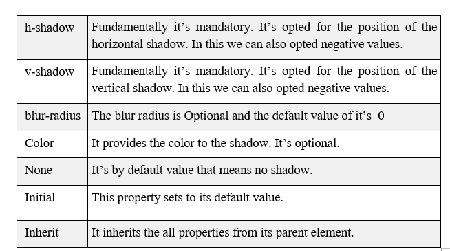
text-shadow: h-shadow v-shadow blur-radius color/none/initial/inherit;
If we are adding many shadows to the text, add them as comma-separated list of shadows. Following are the Property Values-
Example-
The following example displays a text-shadow with a blur effect-
h1{
text-shadow: 2px2px8px#FF0000;
}
The following example display text-shadow on a white text:
h2{
color: white;
text-shadow: 2px2px4px#000000;
}
Example-
Following example display text-shadow showing with a red glow-
h2{
text-shadow: 003px#FF0000;
}
Example-
Following example display text-shadow showing with a red and blue glow-
h2{
text-shadow: 003px#FF0000,005px#0000FF;
}