The CSS border properties permit us to state the style, size, and color of an HTML element border. Following CSS border properties are opted for HTML elements-
• border-style
• border-width
• border-color
• border-radius
Border Style-
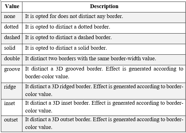
The border-style property specifies the kind of border to display. The likely values which may be given to border-style are listed below-
Below is the example in which the CSS has opted various types of styles-
<!DOCTYPE HTML>
<HTML>
<head>
<style>
p.none {border-style: none;}
p.dotted {border-style: dotted;}
p.dashed {border-style: dashed;}
p.solid {border-style: solid;}
p.double {border-style: double;}
p.groove {border-style: groove;}
p.ridge {border-style: ridge;}
p.inset {border-style: inset;}
p.outset {border-style: outset;}
p.hidden {border-style: hidden;}
</style>
</head>
<body>
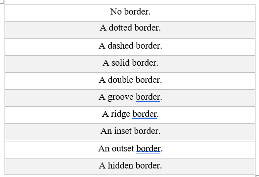
<p class="none">No border.</p>
<p class="dotted">A dotted border.</p>
<p class="dashed">A dashed border.</p>
<p class="solid">A solid border.</p>
<p class="double">A double border.</p>
<p class="groove">A groove border.</p>
<p class="ridge">A ridge border.</p>
<p class="inset">An inset border.</p>
<p class="outset">An outset border.</p>
<p class="hidden">A hidden border.</p>
</body>
</HTML>
This will provide the following output. We may run the code in any browser to get better understanding.
The output is-
Border Width-
The border-width property is opted to set the border width. It is set in pixels. We can also set the width of the border by opting pre- distinct values, thin, medium or thick.
Example- CSS border-width
<!DOCTYPE HTML>
<HTML>
<head>
<style>
p.para1w {
border-style: solid;
width:200px;
border-color: green;
}
p.para2w {
border-style: solid;
width:100px;
border-color: red;
}
</style>
</head>
<body>
<p class="para1w">This is a solid red border</p>
<p class="para2w">This is a solid green border</p>
</body>
</HTML>
Output-
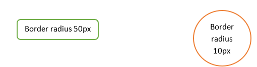
Border radius 50px
Border radius 10px
Border Color-
This property is opted to set the color of HTML elements border. There are three methods to set the color of border.
• Name: It specifies the color name. For example: "red".
• RGB: It specifies the RGB value of the color. For example: "rgb(255,0,0)".
• Hex: It specifies the hex value of the color. For example: "#ff0000".
Following code depicts how to opt border-color.
<!DOCTYPE HTML>
<HTML>
<head>
<style>
p.para1{
border-style: solid;
border-color: green;
}
p.para2 {
border-style: solid;
border-color: red;
}
</style>
</head>
<body>
<p class="para1">This is a solid red border</p>
<p class="para2">This is a solid green border</p>
</body>
</HTML>
Output for above code is-
This is a solid red border
This is a solid green border
Border Radius-
Border-radius is opted to give the radius for border, opting this we can make a circle in a document. Following code depicts the opting of CSS border-radius-
<!DOCTYPE HTML>
<HTML>
<head>
<style>
p.parar1{
border-style: solid;
border-radius: 100%;
border-color: green;
}
p.parar2{
border-style: solid;
border-radius: 50%;
height:100px;
width:100px;
border-color: orange;
}
</style>
</head>
<body>
<p class="parar1">This is a solid orange border</p>
<p class="parar2">This is a solid green border</p>
</body>
</HTML>
Output of the program is given below-